A unique recipe tailored for your pet
tails.com specialises in tailored food for your pet, which currently can only be purchased online. Their product range is primarily for dogs, however their north-star is to eventually cater for all different types of pets all over the world.
The challenge
The product launched their digital presence in 2013. I became part of their team in 2018 and was the sole product designer at the time. When I began my journey with tails.com I spent some of my time understanding the underlying complexity behind the product.
I discovered several challenges.
- Distribution of the brand’s identity was slow. Incorrect or old styles were being misused throughout the company.
- Multiple old, experimental and new brand visuals impacted the customer’s perception of the brand, which created confusion and customer trust issues.
- Average page load times and website accessibility impacted the discoverability of tails.com products and services, which would impact sales.
- Internal tools had misleading user flows, which led to customer service challenges and problematic product launches.
- Knowledge about the product had not been documented so it took time to onboard new colleagues.
- Tools were needed to help measure the impact of experiments and allow teams to self-serve.
- Balancing pet wellbeing and company profit proved to be challenging.
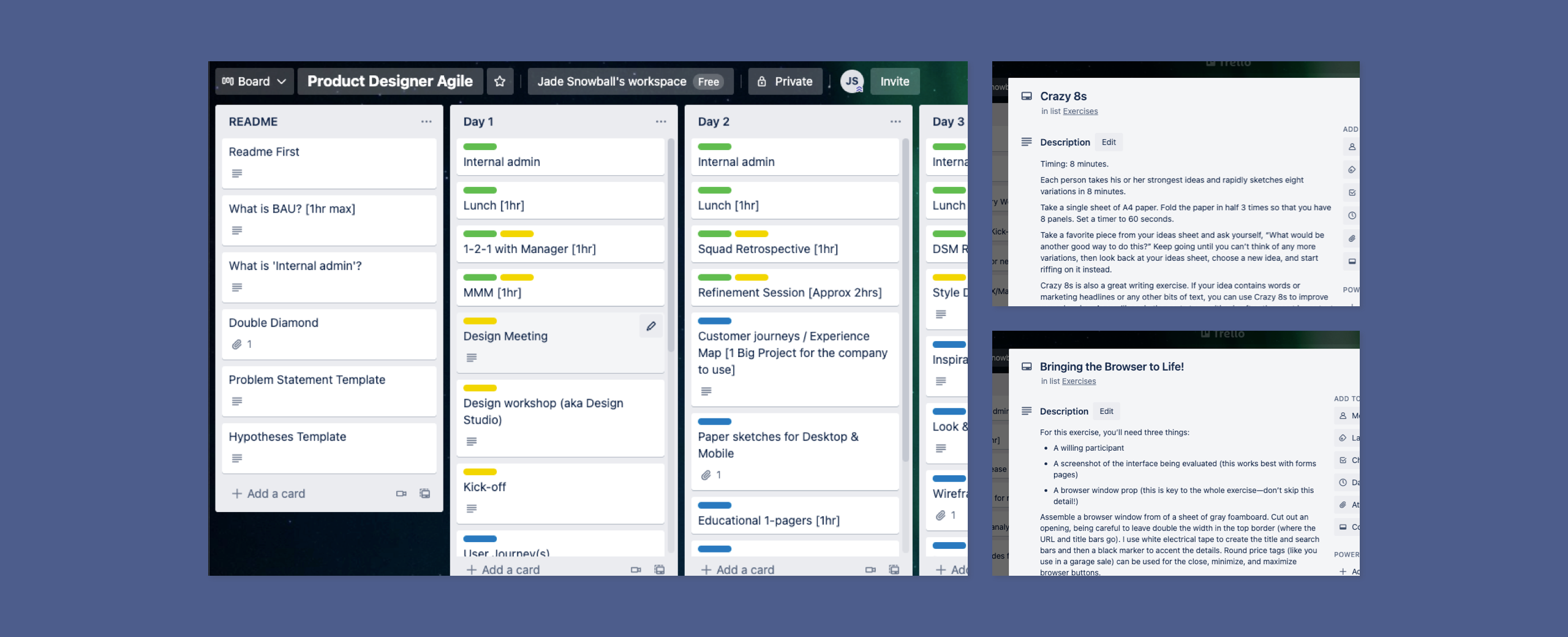
- Product Design was new at tails.com. So, I had to learn the squad rituals and establish my own flexible workflow that would work within squad sprint cycles regardless of which squad I was currently working with.
My role
There was a lot to take on and my role at tails.com was yet to be defined. During my journey at tails.com my role included:
- Using a variety of tools to gain qualitative and quantitative data, which was used to help make improvements and decisions that would impact the overall customer experience (maze.com, Tableau, Heap, SessionCam, Lookback.io, surveys, customer calls).
- Creating an onboarding process for Product Design.
- Developing the Product Designer role within the squad’s agile framework.
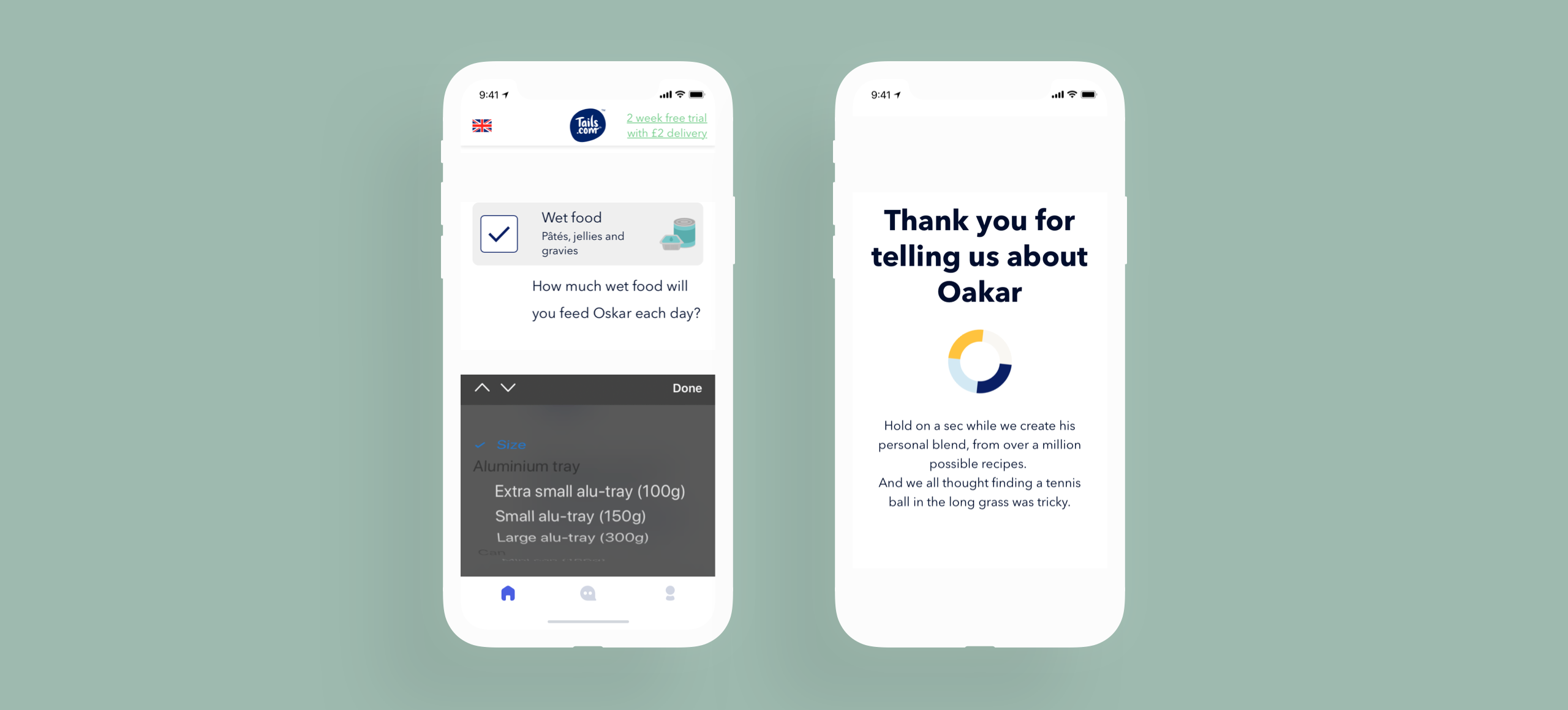
- Facilitating internal workshops, which would lead to new experiments and features.
- Creating specifications and designs that the squad could use to build new features or experiments.
- Completing a competitor analysis to understand where tails.com stood in the market.
- Leading in-house training.
- Beginning their design system.
Jade has a very collaborative approach to Product Design. She involves the entire team, including software engineers, early on in the process. This produces better ideas and well informed product designs.
Benny Johansson, Lead Software Engineer – Squad Lead
Discover
tails.com’s history
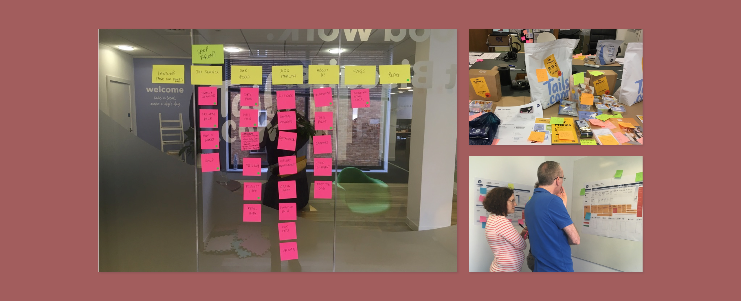
Start-ups have a tendency to move fast, which can lead to technical and design debt. When I began my career at tails.com there was a lack of documentation about their product and brand. I felt it was important to understand and document the architecture of their current systems and understand how, why and who uses each system for future colleagues. From a prospective customer point-of-view this created trust issues and general unease towards a company they’d never used before especially if we were to expand outside of the UK.
I completed a design audit to assess how customers perceived the brand and found several inconsistencies and accessibility issues:
- Multiple UI designs eg. multiple styles for 1 button, leading to bloated code, usability issues and confusion for both customers and colleagues.
- No alt tag information on images so users with screen readers would find the site difficult to use, which would be important to people with visual impairments. This could include some guide dog owners.
- Several UI designs did not pass AA (poor contrast on elements made it difficult to use UI elements or read content for those who have impaired vision or are colour blind.)
Develop
Creating a foundation and introducing a new tool
Multiple tools had been used to create design files, which were often spread across the server. It was time consuming to find the latest working files. After speaking with the creative team and developers we decided that we needed to consolidate the workflow between teams ideally using a single tool. Multiple tools were looked at, but we needed something that could be quickly adopted.
We decided to use InVision as it solved a variety of problems and could integrate with our existing tools. Problems that were solved included:
- Several collaborative tools that could be used remotely
- The ability to prototype designs for user research
- The ability for the squad to leave comments
- A workflow feature so that teams knew the status of current designs
- Prototypes created some developer code
- We could build a Design System that was available to everyone, which would reduce brand confusion and begin to consolidate the user experience
To help solidify the correct brand going forward I began building tails.com’s design system with the help of the creative team. The design system was available to anyone working with tails.com. I also began to tweak the online colours so that they would pass AA (at minimum) and began to consolidate UI styles. New features had specifications to include alt text when images were involved and I began to test designs for colour blind people.
Deliver
Building a design system that would boost productivity and improve the user experience
The design system helped consolidate the brand identity and reduced confusion for the customer and internal teams. We removed old product details, updated the brand voice and began to integrate code within the design system that was practical for the developers. Developers became more aware of the website UI and if external teams were looking for assets, we would redirect them to the design system. As the product design team grew, the design system was also used to onboard them and help them get started within their squads.
There was some trial and error using InVision’s design system as it was a brand new product for them and making time to improve, educate or update the design system proved to be challenging. The brand was also evolving so finding a smart way to update designs quickly was also a challenge.
However, the design system helped us to rapidly iterate and test new features in multiple languages, whilst reducing developer involvement. Future work used the design system to help support internal tools and enabled our team to focus on some of the bigger user experience issues that were impacting users both internally and externally.
