Introducing the world of mystery to new and old fans
Since the early 1900s, Agatha Christie penned mysterious detective stories which continue to capture the imagination of readers. In 2014, readers old and new were trying to engage with the Agatha Christie website on different devices. The existing website was slow, dense and complex and only accessible on desktop.
I was part of the team to redesign the digital experience to be accessible on all devices and engage new readers to the world of Agatha Christie.

The challenge
Our goal for the project was to engage new and old readers on any device before the launch of a new book called ‘The Monogram Murders’ by Sophie Hannah. We wanted to make the website more exploratory and create an accessible experience that could be read in multiple languages across the world.
Our high level goals were to:
- Make the site more engaging for old and new users across multiple countries.
- Make the site accessible on all devices such as mobile and tablet.
- Reflect the suspenseful and mysterious world of Agatha Christie.
My role
I designed the brand, illustrations and layout for the new website whilst collaborating with my Creative Director, Project Manager, Front-end Developer and UX Architect. I explored different illustrative ways and colour palettes that were familiar to the fan-base and enhanced the world of Agatha Christie.
Discover
Who is Agatha Christie?
I had never read or watched an Agatha Christie story until I had started working on the project. I had heard of her famous protagonists like Hercule Poirot and Miss Marple, but I had never engaged in any of her content. What made fans enjoy her stories? I decided to read And Then There Were None, watch the television series that told stories of Poirot, read what fans had to say on Agatha Christie’s forum and went to the live performance of The Mousetrap to better understand the world Agatha Christie had created.
The atmosphere of suspense, mystery and revelation captured the imagination of Agatha Christie’s fan base. There were many twists and turns in her storytelling, which made her novels appealing.

Develop
The redesign
There were several design problems that we needed to consider:
- How do we design this website so that it can be translated into several languages?
- How can we keep Agatha’s Christie’s characters in the imagination of the readers?
- How can we engage new fans discovering Agatha Christie for the first time?
- How do we make the site engaging with limited assets?
- How can we share the latest files with the remote development team?
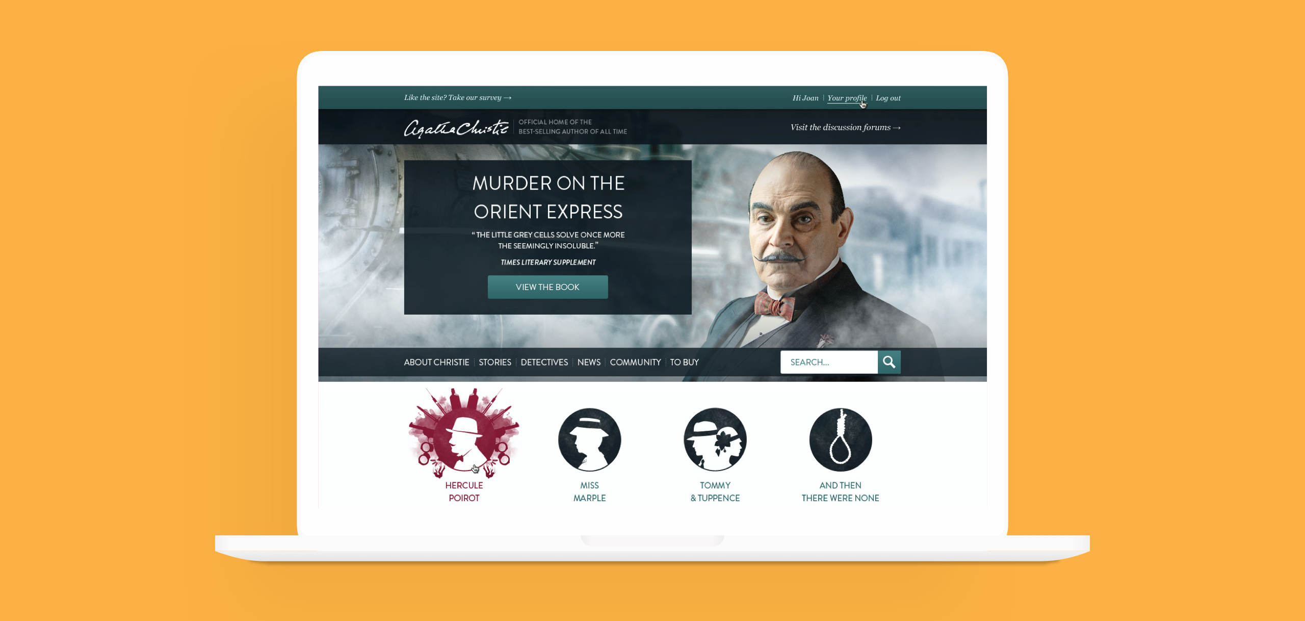
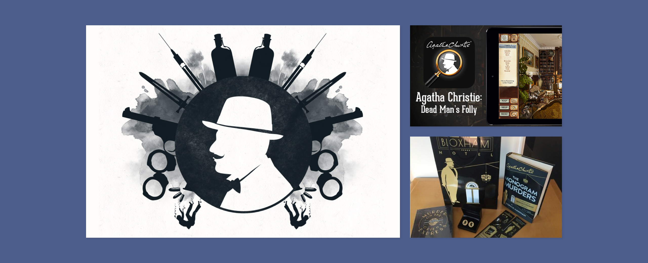
Early in the process, the team behind Agatha Christie wanted readers to use their imagination to picture the main protagonists. I designed several silhouettes of the characters that featured some of their core traits and elements that they had been associated with. To bring the static silhouettes alive, I worked with our in-house front-end developer to create animated CSS events when users interacted with the website. Our in-house developer created a component library for the remote team (Australia) to help speed up development and keep their designs consistent.
She translated the client’s needs into stunning designs which were flexible enough for the engineers to build without sacrificing accessibility or browser compatibility.
Jane Kelly, Frontend developer
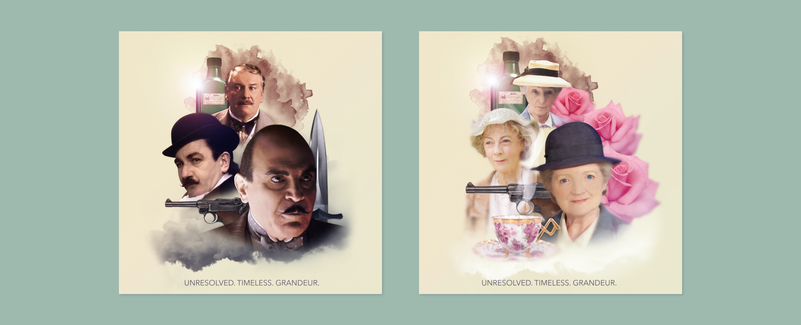
I chose typography and a colour palette that reflected the time period associated with the books (art deco). I also chose to create iconography and illustrations that looked more like ink to symbolise the act of penmanship rather than blood to avoid making the overall site look like a murder scene. To create a sense of mystery, I added several fog effects to illustrations and photography.

Deliver
The launch
We had mixed feelings from the website’s current user base. Some fans missed some of the content that was on the previous site (such as puzzle games) and even though we made the website typography more accessible by enlarging the font size to improve the legibility of the content, some current fans preferred a much smaller size. Overall, current fans enjoyed the updated experience and newer fans from around the world were able to access Agatha Christie content in their own language.
Unexpectedly, the illustrations began to feature on book covers, games and merchandise. It was phenomenal seeing the illustration work as part of the Agatha Christie franchise as new fans and old fans began to engage with the updated brand and digital experience.

