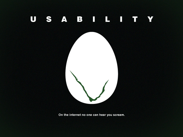
Still reading ‘Don’t Make Me Think’ and it ended up making me think of this. Have you ever been to a website where you’ve just been bombarded with stuff? So much information that it’s wanted to make you scream? Or so many things shouting at you you’re not sure what to click on. Or how about the classic ‘It looks like a button/link, why can’t I click on it?’ 🙂
I try not to make this mistake when I design websites. It’s often been a case when people have to pause and think about what to click on or try to find things.
What I’ve started to do is design buttons and links individually in another Photoshop file so that I don’t jump straight into Photoshop and start designing a website. It also means I have less clutter distracting me and it’s also good for developers to work with. It also means I can experiment with different colour schemes before finally deciding on what fits best for it’s purpose. It’s something I’ve noticed web designers begin to do on places like Dribbble.